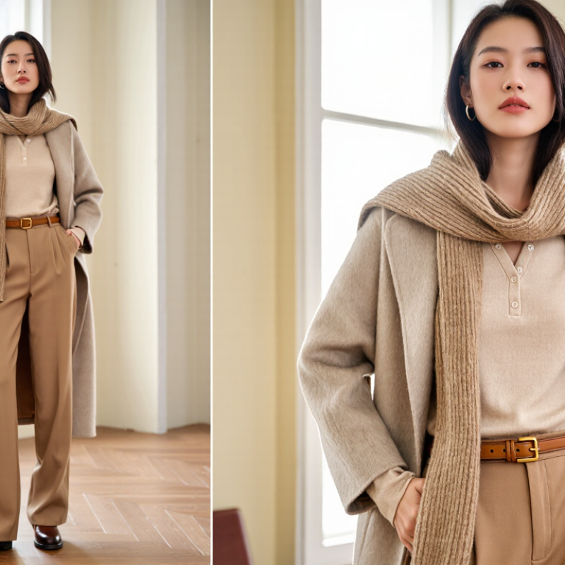
Creating a monochrome outfit does not mean wearing one flat shade from head to toe. It means building visual depth within one color family. In this guide, you will learn how to coordinate colors for a monochrome outfit with greater confidence and control. A soft beige shirt can meet camel trousers, while dark brown shoes anchor the look. Small differences in tone often create the strongest effect. Texture matters, too. A ribbed knit, smooth leather belt, and brushed wool coat can prevent a single-color outfit from looking lifeless. Keep it balanced.
Real styling experience shows that monochrome dressing works best when contrast is intentional. A pale blue blouse beside navy denim feels relaxed, yet polished. Black outfits need special care because fabric finish changes how the color appears under daylight, office lighting, or evening lamps. I recommend checking the complete outfit near a window before leaving. It reveals mismatched undertones that mirrors may hide. Still, not every combination will work perfectly. I have found that some “safe” pairings look dull after adding similar textures. That is useful feedback, not failure. Try changing one element, such as a brighter accessory or a deeper shoe shade. Proportion also deserves attention. A long coat may overwhelm delicate layers, while a cropped jacket can sharpen wider trousers. This article offers practical color principles, wearable examples, and thoughtful adjustments for different settings. Expect guidance, not rigid rules. Personal coloring, fabric quality, and comfort can change the final result. Trust observation. Dress with intention.
Monochrome dressing means building an outfit around one color family, not wearing one identical shade. A navy shirt, ink trousers, and pale blue shoes can still count. The core principle is controlled variation. Adjust value, saturation, and texture while keeping the hue visually related. A professional colorist would test the garments in daylight, because warm indoor bulbs can distort undertones.
Start with a dominant shade, then add two nearby values. For example, pair a clay knit with rust trousers and muted terracotta socks. Keep one element quieter, especially near the face. This prevents the outfit from looking flat or overly deliberate. Texture also creates separation: brushed wool, smooth cotton, and matte leather reflect light differently. The eye notices depth before it notices exact color.
The 2025 Global Resale Report projects the secondhand apparel market will reach 367 billion dollars by 2029. That growth supports choosing versatile pieces that can repeat across outfits. A carefully coordinated monochrome wardrobe can extend each garment’s usefulness. I still break the rule sometimes. A bright belt may interrupt the palette, but that small mistake can make the outfit feel lived-in rather than engineered. Outfit photos should be checked in natural light before judging the color balance.
A monochrome outfit begins with a base hue that feels natural against your skin. Warm undertones often suit camel, terracotta, cream, olive, and muted gold. Cool undertones may look balanced in navy, berry, charcoal, icy blue, or soft lavender. Neutral skin can move between both groups with fewer adjustments.
Still, skin tone is only part of the decision. Personal style should guide the final choice. A quiet dresser might prefer layered gray, oat, or dusty blue. Someone with a sharper style may enjoy deep red, espresso, or saturated green. Test the color near your face in daylight. Store lighting can make a shade appear kinder than it really is. Check your reflection beside a window, not only in a mirror.
Use three versions of one hue: light, medium, and dark. For example, pair a pale olive shirt with moss trousers and deep forest shoes. Keep fabric texture in mind. A matte knit can soften a strong color, while satin makes it appear brighter. I once chose a warm beige that matched my undertone but felt lifeless with my wardrobe. The color was technically right. My confidence was not. This method is useful, but never perfect. If a shade feels uncomfortable, adjust its depth or saturation instead of forcing it. Small changes can make the outfit feel personal.
Choose a base hue that matches your skin tone and personal style.
The chart uses standard HSL color-wheel angles from 0° to 360°. Warm undertones often pair well with earthy terracotta, camel, and olive hues; cool undertones can explore cobalt, navy, and berry; neutral undertones have flexibility with teal, charcoal, and taupe. Use lighter and darker values of the same base hue to create a balanced monochrome outfit.
Top 2026 How to Coordinate Colors for a Monochrome Outfit?
Build Depth with Tints, Shades, Textures, and Strategic Layering
A monochrome outfit uses one color family, not one identical shade. I start with a base tone that suits the setting and my natural contrast. For a quiet office look, charcoal trousers can anchor a soft gray shirt and smoke-gray overshirt. The small temperature shift matters. Cool grays feel cleaner, while warm grays appear softer under indoor lighting. I check the outfit near a window because artificial light can hide muddy combinations.
Tints, shades, and textures create the missing contrast. A pale blue knit can brighten deep navy trousers without breaking the color story. A matte wool layer beside polished cotton gives the eye two surfaces to read. Ribbing, brushed fabric, and smooth leather-like materials catch light differently. Keep one texture dominant. Too many surfaces can look accidental. I learned this after pairing a heavy ribbed sweater with a raised scarf. It felt bulky, not dimensional.
Layering should reveal controlled intervals of color. Let a lighter collar show above a darker crew neck, or expose a narrow hem beneath a longer jacket. Use the darkest shade near the body for a sharper silhouette. Reverse it for a gentler effect. Accessories should repeat the palette, but they do not need to match exactly. A muted belt and slightly faded shoes often look more credible than perfect coordination. Try the outfit while moving. Static mirror checks miss bunching, glare, and uneven proportions.
Top 2026 How to Coordinate Colors for a Monochrome Outfit?
Monochrome dressing works best when one color appears in several controlled shades. In 2026, soft tonal outfits remain practical because they look polished without feeling rigid. Start with a dominant color, then add one lighter and one darker version. A charcoal shirt, slate trousers, and pale gray sneakers create depth without visual noise. Keep it quiet.
Balance proportions before adding accessories. A loose jacket pairs well with straight or tapered trousers, while wide-leg pants need a shorter, cleaner top. This relationship keeps the outfit from looking heavy at the bottom. If every piece is oversized, the color harmony may disappear beneath excess fabric. Texture does the work. Knitwear, brushed cotton, smooth leather, and matte metal can separate similar shades naturally.
Contrast should appear in small, deliberate areas. Choose accessories that are two or three tones away from the main outfit, rather than using a completely unrelated color. A deep brown belt can warm an olive look, while silver details sharpen cool blue layers. I once matched every accessory too closely, and the result looked flat in photographs. That mistake taught me to leave one element slightly unexpected. Check the outfit in daylight, especially near the face, because indoor lighting can hide muddy color differences. A final adjustment may be as simple as changing the bag, rolling a sleeve, or exposing a narrow layer underneath.
| Monochrome Color Family | Base Garment | Supporting Shade | Accent Shade | Recommended Contrast | Proportion Guide | Accessory Direction | Best Use |
|---|---|---|---|---|---|---|---|
| Black and Charcoal | Black tailored trousers or a column dress | Charcoal knitwear or soft blazer | Pale gray or washed black | Medium contrast through lightness, not hue | Keep the darkest shade on the larger visual area | Matte leather, brushed metal, or textured fabric | Office, evening, and minimalist dressing |
| White and Ivory | Ivory trousers, skirt, or structured coat | Soft white shirt or cream knit | Oatmeal, pearl gray, or ecru | Low contrast for a clean, continuous effect | Use one lighter shade for approximately two-thirds of the look | Natural textures, ivory bag, or muted metallic details | Daywear, resort dressing, and warm-weather events |
| Brown and Tan | Dark brown trousers, skirt, or jacket | Camel knitwear or medium tan shirt | Caramel, beige, or sand | Moderate contrast with warm value changes | Place the mid-tone near the face and the deepest brown below | Suede, woven leather, wood, or antique-finish metal | Autumn outfits, smart casual looks, and travel wardrobes |
| Navy and Blue | Navy trousers, jeans, or a midi dress | Denim blue or medium blue overshirt | Sky blue, slate, or muted blue-gray | Low to medium contrast for visual continuity | Use lighter blue near the upper body to prevent heaviness | Canvas, smooth leather, silver-tone metal, or denim texture | Business casual, weekends, and transitional seasons |
| Green and Olive | Olive trousers, cargo pants, or a utility jacket | Moss, sage, or muted forest green | Pale sage or deep bottle green | Medium contrast with subdued saturation | Balance one relaxed piece with one structured piece | Canvas, aged leather, matte hardware, or natural fibers | Casual layering, outdoor-inspired styling, and daytime wear |
| Red and Burgundy | Burgundy trousers, skirt, or knit dress | Merlot, brick, or muted red layer | Rosewood, blush, or deep wine | Medium contrast; keep saturation controlled | Limit the brightest red to a smaller area or accessory | Burgundy leather, dark metal, or tonal knit textures | Evening occasions, creative settings, and seasonal dressing |
| Gray and Silver | Medium-gray trousers, suit, or skirt | Light gray knitwear or graphite layer | Silver gray, pewter, or near-black | Use value contrast and surface shine instead of color contrast | Combine one tailored item with one soft or reflective texture | Silver-tone details, satin, wool, or ribbed knitwear | Modern office looks, formal events, and monochrome eveningwear |
| Pink and Rose | Dusty-rose dress, trousers, or long coat | Blush, mauve, or muted rose top | Deep berry, pale pink, or rose brown | Low to medium contrast with similar undertones | Keep soft shades dominant and reserve deep berry for definition | Soft leather, satin, pearl-like surfaces, or rose metal | Occasions, spring dressing, and refined casual outfits |
Styling principle: A monochrome outfit uses one color family while varying lightness, saturation, texture, and proportion to create depth without introducing a separate dominant hue.
A monochrome outfit gains polish when the shoes support its visual weight. Choose footwear in the same color family, then vary the finish. Smooth leather looks sharper, while suede or woven fabric feels softer. In styling sessions, I match slim trousers with streamlined shoes and fuller garments with sturdier soles. This keeps the silhouette balanced. Keep it grounded.
Accessories should create contrast without breaking the single-color story. A matte belt, structured bag, or narrow watch can add quiet definition. Choose one focal accent, such as a silver-toned necklace or a muted scarf. Repeating that accent twice usually looks more intentional. Less, but sharper. I sometimes add too many details and lose the calm effect, so checking the outfit in natural light helps.
Seasonal changes depend on fabric, texture, and exposure. In summer, lightweight layers and breathable shoes prevent a pale monochrome look from appearing flat. Try linen trousers with canvas footwear and a slightly darker belt. In autumn, brushed textures and deeper shades add warmth without changing the color family. Winter calls for substantial boots, wool socks, and dense outerwear. Spring benefits from lighter shoes and one fresh accent. These adjustments follow practical color and proportion principles, but personal comfort still matters. A theoretically perfect combination can feel wrong after two hours of walking.
It builds an outfit around one color family. The shades can differ in value, saturation, and texture.
Yes. A navy shirt, ink trousers, and pale blue shoes can work together. Their hues remain visually related.
Start with one dominant shade. Add two nearby values, such as clay, rust, and muted terracotta.
Texture creates visual separation. Brushed wool, smooth cotton, and matte leather reflect light differently.
Keep shoes within the same color family. Match streamlined shoes with slim trousers and sturdier soles with fuller garments.Keep it grounded.
Choose one focal accent, such as a muted scarf or silver-toned necklace. Repeat that accent once for a more intentional look.
Summer suits linen, breathable shoes, and lightweight layers. Autumn favors brushed textures, while winter needs wool socks and substantial boots.
Inspect the outfit in natural daylight. Warm indoor bulbs can distort undertones and make colors appear mismatched.
Yes. A bright belt can interrupt the palette and make the outfit feel lived-in. I sometimes add too many details, though.
Comfort matters after two hours of walking. A theoretically perfect outfit may still feel wrong in real life.
Monochrome dressing creates a polished, intentional look by focusing on different variations of one color family rather than matching every piece exactly. Learning how to coordinate colors for a monochrome outfit begins with choosing a base hue that complements your skin tone, reflects your personal style, and suits the occasion. From there, combine lighter tints, deeper shades, and subtle undertones to keep the outfit visually interesting while maintaining a cohesive appearance.
Depth can also come from contrasting textures, thoughtful layering, and balanced proportions. Pair smooth fabrics with tactile materials, vary garment lengths, and distribute color evenly across clothing and accessories. Footwear, bags, jewelry, and other accents should support the main palette without overpowering it. Finally, adapt the intensity and fabric weight of the color to the season: softer, breathable versions work well in warmer months, while richer tones and layered textures add comfort and dimension in cooler weather.